 Painting the exterior of your house is a big project, and there are many steps to follow to ensure you give your home a high quality paint job. Prep work is no exception, but the good news is that proper preparation will pay off. Follow these tips and your home will be easier to paint, the job will go more quickly, and the finished product will look great.
2 Comments
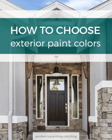 Exterior Color Selection Tips for Homeowners
Q: What are the most common mistakes homeowners make when choosing exterior paint colors?A: Assuming that a colorful and imaginative color scheme will cost a great deal more for product and labor. Unless the scheme is a "painted lady" with numerous colors, this is rarely the case. Accenting unattractive elements such as gutters, downspouts, a protruding garage door, air conditioning units, unevenly placed windows, etc. Ignoring neighboring houses: your color scheme choice should not clash with the neighbor’s house — it’s a lose-lose situation. Choose a scheme that blends with the neighborhood or stands out in a subtle, unobtrusive manner. Landscaping counts: consider tress that change color, flowering shrubs, flower gardens when selection colors, for compatibility. Heavily wooded lots will make colors look darker due to shade; also could camouflage homes, so attention to detail is needed. Greens are not a good choice in this situation. Q: What opportunities do homeowners commonly miss when selecting and placing colors on their homes’ exteriors?A: Color makes a first impression, an individual statement and can enhance curb appeal and even resale value; a creative scheme versus the more typical white could be an opportunity to make that first impression. Don’t overlook interesting architectural detailing; it can often sparkle with a contrasting or accent color. Be observant: drive through various neighborhoods, established and new, to see color in action. Make note of appealing color schemes and consider adapting them to your own home. Assuming no structural work is needed, color/paint is the most cost-effective approach to changing the appearance of a home. Define the entryway by using color as a "Welcome" sign. Windows are an opportunity: they give character to a house. Outlining them lends crispness to the color scheme.  Basic Color Terms The Color Wheel; The color wheel identifies what color family interior paint colors belong to and how they relate to each other. Primary Colors; All colors, with the exception of white, come from primary colors. Blue, yellow and red are the primary colors; combinations of these three colors produce secondary colors. Secondary Colors; Mix equal amounts of two primary colors to create secondary colors. The results are violet (red and blue), green (blue and yellow) and orange (red and yellow). Tertiary Colors; Mix one primary color with larger amounts of another primary color to create tertiary colors. For example, mix one part blue with two parts red to make red-violet. Other Color Terms;
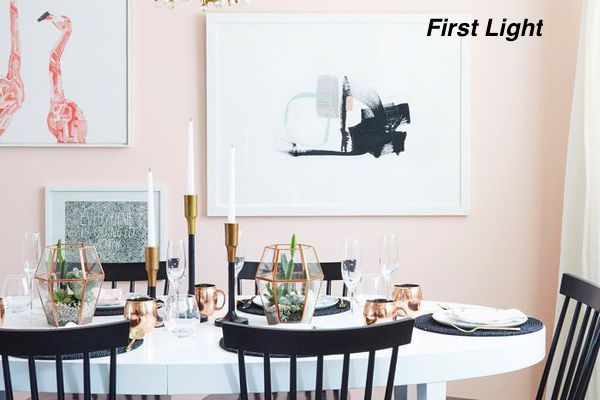
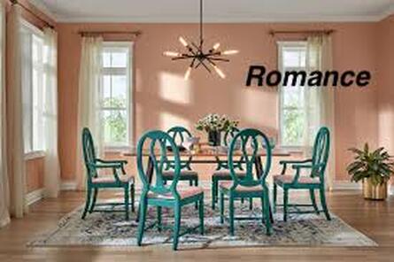
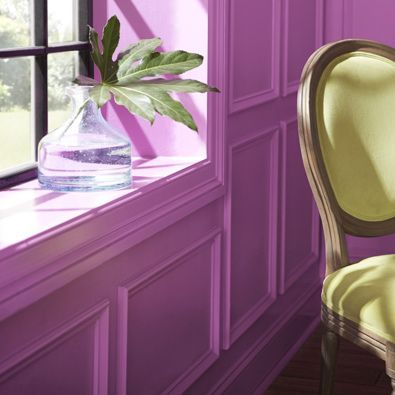 The Effects of Color Different wall colors affect our moods in different ways. Let’s say that you've decided emerald green, your favorite color, is going to be the main focus in your room. Before you buy gallons of emerald green paint, consider the effect it will have on the appearance and mood of the room. Warm and Cozy Colors; Warm and cozy colors, located on the right side of the color wheel, convey a message of togetherness and strength:
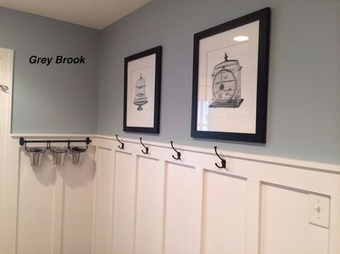
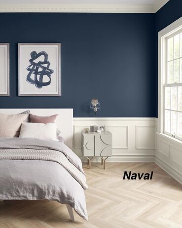
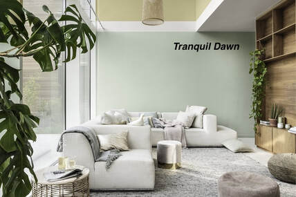
Cool and Soothing Colors; Cool and soothing colors, located on the left side of the color wheel, provide a sense of calm and feelings of trust:
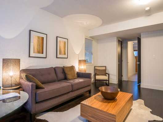
Pastel Colors; Pastel colors are the result of adding a large amount of white to colors. They create a comfortable, airy feeling in any room. Neutral Colors; Neutral colors include shades of white, beige, taupe, gray and black. Neutral colors are the easiest colors to use for one obvious reason: They blend with most surroundings. Neutral colors can also be stylish and dramatic. For instance, black and white are neutral colors that create a wonderful palette for additional colors. If you choose neutral colors, use bold-colored accessories to accent the walls and add interest. When you’re ready for a change, simply change out the accessories.  Various Color Schemes A color scheme is any set of colors that work together to create a visually appealing layout. The following are suggested painting ideas, but the possible combinations are limitless. Complementary Colors; Complementary colors are located opposite each other on the color wheel. Each color brings out the richness in the other. When using complementary colors, one color should be subtle and the other color should be more dominant. For example, an intense, dark violet should be paired with a medium to light yellow. Split Complementary Colors; Split complementary colors offer a wild and daring color palette. Select a main color. Next, find the complementary color, and select colors from each side of the complementary color. These colors are excellent when layering a faux finish. Related Colors; Related colors are located next to each other on the color wheel. These colors produce a less contrasting effect than complementary colors. For example, a dark blue-green combined with a light blue can give the feeling of floating in a blue lagoon. Monochromatic Colors; Monochromatic colors are colors with the same hue but different tones, values and saturation. For example, a paint swatch card has several different values of one color. Using two or more monochromatic colors creates a stylish and pleasant look. 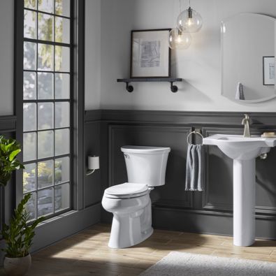 Planning Your Color Scheme Here are a few tips when planning your color scheme:
 Using Color to Create an Illusion Use colors to create an illusion in any room by contrasting different values; light and dark, warm and cool:
 Using Accent Colors to Change a Room Use accent colors, whether bold or subtle, to pull a room together:
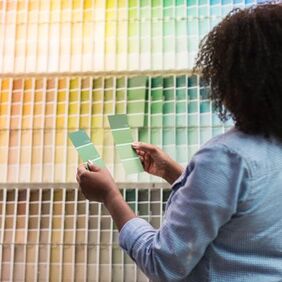 Color Chips and Swatches
Chips and swatches are helpful in the color selection process. Here are a few things to keep in mind:
Tip Remember: To the human eye, most colors on paint chips look a shade darker when applied to real rooms. If you're worried that a color is too dark or bold, consider one shade lighter. How to Read a Paint Color Chip DisplayPaint color chip displays can look like an overwhelming rainbow of choices at first glance. But the displays are organized to help you come up with interior paint ideas.
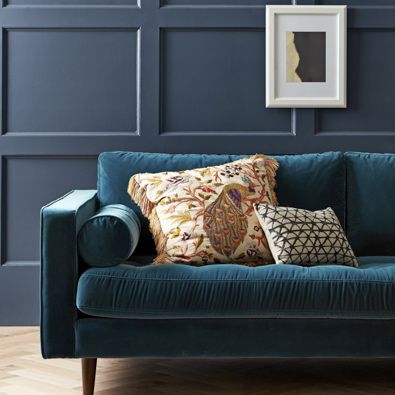
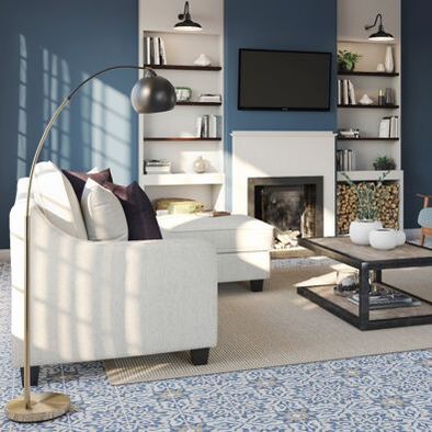
 Small rugs, artificial plants, and pillows that match your sofa might make your space appear cheap or unfinished. According to the pros, decorating a room with an accent wall and hanging a TV above a fireplace are both design no-no’s. Consider swapping out pillows that match your sofa. 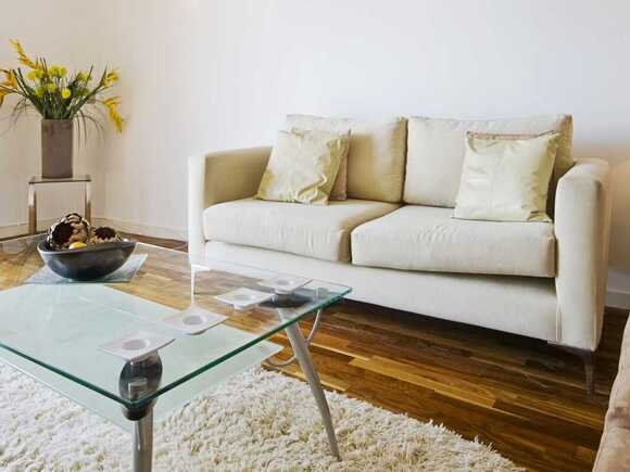 You should perhaps toss couch pillows that match your sofa, including any that might have come with it. You should perhaps toss couch pillows that match your sofa, including any that might have come with it. Instead, play with texture, color, and pattern to accent the main fabric, this is an investment that will add interest, and the fabrics will help pull your room together. If you want a cozier space, it's time to toss harsh white lightbulbs.  Replace your harsh, cool whites with a soft, warm white bulb, this adds warmth to your room like the light from a candle or roaring fire. Take down any window treatments that make it difficult for you to get natural light.  Natural light can brighten a room, make it look larger, and show off light-catching finishes, according. So, naturally, the first thing she thinks you might want to get rid of is any window treatment that makes it especially difficult for you to get natural light. Window treatments should frame a space, but they don't have to be overbearing or heavy to add warmth. Using sheers or translucent metallics are a way to create some level of coverage without adding weight. But if you still want to block the sun or have privacy, layering different window treatments to add dimension and texture to your space will also allow for more options to handle light and privacy. Heavy or dark fabrics and finishings might weigh down your space.  While it was once really popular to use dark heavy fabrics and finishings to create warm sophisticated spaces, today these materials just make rooms feel "overbearing" and kind of gloomy. Because of this, you should consider swapping out thick wool curtains, and heavy blankets for "lush textures and warm-colored accents" that can help to elevate your space instead of dragging it down. Accent walls aren't as stylish as they once were. 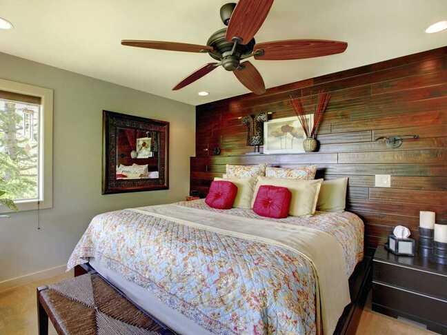 Although accent walls can add a big statement to a space, you should be careful about how you use them because of how easily they can look dated. Instead of committing to designing a whole wall you simply create a decorative focal point by using easy-to-remove pieces like art, plants, or a mirror. If there's a chair rail in your dining room, consider removing it to make your space look bigger.  The chair rail is a "puny strip of wood" that doesn't do much beyond awkwardly splitting a room in half, thus making the entire space look smaller. To open up your space, she suggests removing the railing and opting for "plain walls or a more substantial wainscoting" for a much larger design impact. If most of the pieces of furniture in your home are a version of stained wood, you might want to switch some of them out. 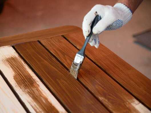 When most of the furniture you own is wood-stained, it can start to look a bit "drab and dreary," you should mix things up a bit — not only with the wood species and stain colors, but take it a step or two further and bring in some painted pieces as well as some non-wood pieces. Rugs that are too small for your space can make your room look awkward. 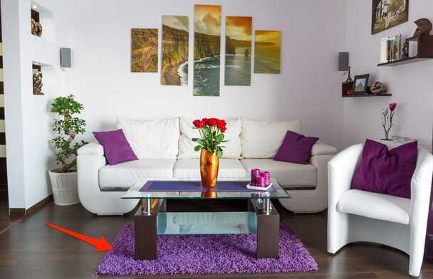 It doesn't matter how nice your rug is — if it's too small for the room, you should probably get rid of it. "Having a rug off-scale in a room — no matter how fine the rug is or how nice the furniture is — makes a room look cheap". A rug under a dining table looks great, unless it's so small that the dining chairs don't fit on the rug or only fit when the chairs are pushed in. Builder-grade tile and backsplashes can come off as dated and boring.  This is standard in many homes built within the last 20 years, usually basic beige porcelain or ceramic tile is typically used for all the floors, backsplashes, shower, and tub surroundings. All the tile in a home should not be the same. It may make it easy for potential buyers to visualize their things in the home, but there is no personality in that. You might want to try using different materials or shapes to switch up your space and make the tiles feel more updated. If your TV is above your fireplace, you might want to consider moving it. 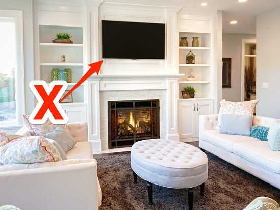 Though the space above a fireplace might be a popular place to hang your TV, it’s a big no-no. The fireplace place is a focal point in a room. Get rid of the TV and enjoy a moment by the fire without the distraction of a screen. Fake plants and real plants that haven't been properly cared for don't have a place in most spaces. 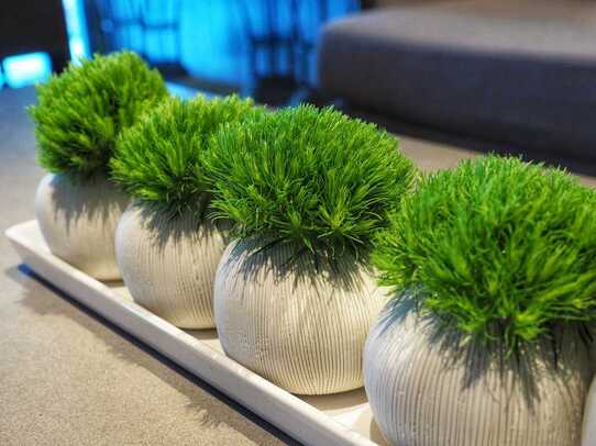 Having a beautiful pop of greenery in your home design can definitely make a statement and be a way to bring the outdoors in, but a faux plant can become a dust magnet. Depending on the quality, it can cheapen the overall look and feel of your home. That said, real plants can be even worse if they're dying or dead because they signal a “lack of care for your space and sometimes can produce an odor, which is unpleasant. Matching couch sets could appear dated and make your space feel like a furniture showroom.  You should consider swapping out some pieces if you have a matching sofa and love seat. In many cases, these matching sets can appear dated or so matchy-matchy that your space looks like a furniture showroom. Go for a tailored look and replace the love seat with two comfortable upholstered chairs.
 the most common mistakes made when arranging furniture in a home. One of the biggest mistakes is placing your sofa directly against a wall. It’s an incredibly common decision people make when arranging furniture in their living room because it’s counterintuitive. You’d think that placing a sofa directly against the wall would make the space appear bigger when, in actuality, pieces of furniture need breathing room, and the visual effect is more pleasing when they are pulled out a bit from being flush with walls. Often people have good taste, but don’t know how to lay pieces out. Here’s the things professionals notice when entering a home. Often people have good taste, but don’t know how to lay pieces out. Here’s the things professionals notice when entering a home. 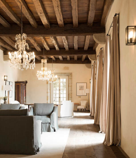 THE NUMBER OF CUSHIONS ON THE SOFA Big is always better: Nothing looks worse than a couple of sad, small, flat cushions on a sofa. Make sure your pillows are well-made, and filled with quality goose down, and measure at least 60cm x 60cm. Put one in each corner of the sofa and preferably one in the middle. Add a quality throw for impact. ALL THE LITTLE ITEMS The small items in a room are often the first thing people notice. You often walk into beautiful homes to encounter endless tiny memorabilia sitting on the mantel gathering dust. Rooms look better uncluttered and curated. HOW SHELVES ARE ARRANGED How you organise your books says a lot. Books stacked in piles generally show that no one is reading them and they are there as decorative props. Collections of hardbacks look best when they are more accessible. 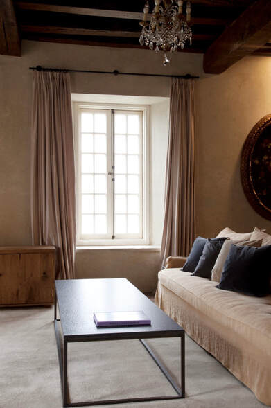 ALL THE WOODWORK ON THE WALLS Investing in well-proportioned trims and architraves can establish the look and foundation of a room. A cheap stock trim or casing can’t be hidden. WHAT IT SMELLS LIKE INSIDE Candles have their place, but there’s nothing worse than an overwhelming fragrance as soon as you enter a home. Whether it’s too many candles, a powerful diffuser or incense, you can’t help but wonder what they are trying to hide. IF THE CURTAINS TOUCH THE FLOOR It seems like a minor detail but when a gap exists it can be one of the first things you notice when you enter a room. Because it is out of scale. 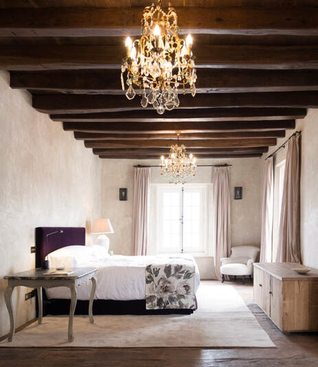 HOW THE BATHROOM IS STOCKED Hand soap and clean hand towels are not only subtle, elegant additions to a powder room, but also important ones. Not only does it elevate the hand-washing experience, it shows you care about your home. WHERE THEIR FURNITURE WOULD GO Try to decide how I would arrange your furniture in your house — not your furniture.  ARTWORK THAT’S TOO SMALL Don’t hang artwork anything that’s too small, or get two small pieces and spacing them apart to try and give the illusion that it’s taking up more space. Smaller artwork can accentuate an obvious lack of space in a room. If you have open wall space above the sofa, it’s a great place to hang a large piece of artwork. If you can’t find a large enough piece to span the length of two-thirds of your sofa, get as large of a piece as you can, and then add smaller pieces on either side of the large piece, gallery wall-style. TOO MUCH FURNITURE One of the main mistakes is too much furniture in a room. Keep good flow around a living room furniture layout. A space should never feel too cramped. To achieve an aesthetic that is pure and simple with plenty of space, maintain a comfortable distance (minimum 50 centimetres if possible) from the edge of a sofa or armchair seat from the edge of the coffee table. Less is more. Start with one incredible piece and build around it.   Painting the outside of your home can be quite a bit of work and a sizable commitment. If you’re one of the many homeowners questioning whether the value of a new exterior paint project is worth its cost, we have the answer for you: it is! The benefits of a paint job go much deeper than just a fresh, new look … though that is another great reason.
 Making sure you hire a true professional will ensure that you get the most durability and satisfaction out of your paint job. Save yourself time and frustration by asking the right questions to weed out inexperienced and unqualified companies pretending to be professional painters. Before you commit to a company, come prepared with these in-depth questions to find the best company for your painting project. These are the top 12 important questions to ask your exterior home painter. A true professional will be able to answer all these questions in full detail:
|
AuthorWrite something about yourself. No need to be fancy, just an overview. Archives
February 2020
Categories |
 RSS Feed