Enos Executive Painting
  • Home
  • Our Services
  • FREE Estimate
  • Sign Contract
  • Exterior
  • Interior
  • Real Estate Services
  • Reviews and Testimonies
  • Commercial
  • Payment
  • Other Testimonies
  • Sitemap
  • Contact
  • Tips/News
  • Thank you customers
  • Home
  • Our Services
  • FREE Estimate
  • Sign Contract
  • Exterior
  • Interior
  • Real Estate Services
  • Reviews and Testimonies
  • Commercial
  • Payment
  • Other Testimonies
  • Sitemap
  • Contact
  • Tips/News
  • Thank you customers

Interior Paint Ideas and Schemes - Enos Executive Painting

1/23/2020

3 Comments

 
Picture
Basic Color Terms

The Color Wheel; The color wheel identifies what color family interior paint colors belong to and how they relate to each other. 

Primary Colors; All colors, with the exception of white, come from primary colors. Blue, yellow and red are the primary colors; combinations of these three colors produce secondary colors.

Secondary Colors; Mix equal amounts of two primary colors to create secondary colors. The results are violet (red and blue), green (blue and yellow) and orange (red and yellow).

Tertiary Colors; Mix one primary color with larger amounts of another primary color to create tertiary colors. For example, mix one part blue with two parts red to make red-violet.
​

Other Color Terms;
  • The hue of a color is the basic color. For example, blue is the hue in light blue and dark blue.
  • Tone is the result of adding white and black (gray) to a color. Tone makes colors more pleasing to look at instead of pure pigment.
  • The value of a color describes the amount of white or black in the color. The value ranges from light to dark on a gray scale.
  • The saturation of a color refers to its strength or weakness in different light. Think about it in terms of bright or dull.​
Picture
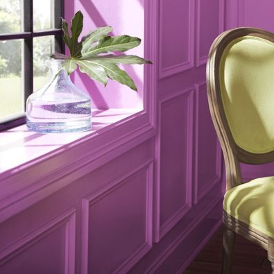
The Effects of Color

Different wall colors affect our moods in different ways. Let’s say that you've decided emerald green, your favorite color, is going to be the main focus in your room. Before you buy gallons of emerald green paint, consider the effect it will have on the appearance and mood of the room.
​

Warm and Cozy Colors; Warm and cozy colors, located on the right side of the color wheel, convey a message of togetherness and strength:
  • Red represents energy, power and passion. It’s also been found to stimulate appetite so it’s a common choice for dining rooms.
  • Less aggressive than red, orange creates warmth and a sense of joy. However, it’s very hard to tone down and is often used as an accent color only.
  • Yellow has different effects depending on how much is used. Generally, yellow is a happy and uplifting color, but when it’s overused, it can become distracting and overwhelming.

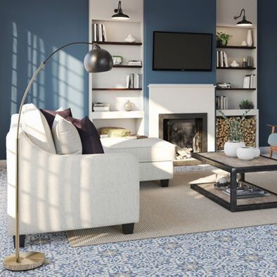
Cool and Soothing Colors; Cool and soothing colors, located on the left side of the color wheel, provide a sense of calm and feelings of trust:
  • Green conveys a sense of renewal and growth. It’s also one of nature's most prominent colors and blends easily with any room.
  • Blue is generally a peaceful color. Light blue can make a room appear bright and refreshing, while a deep blue creates a sense of dignity.
  • Violet combines the calm of blue and the energy of red. Violet is often used in bedrooms to communicate an air of serenity.

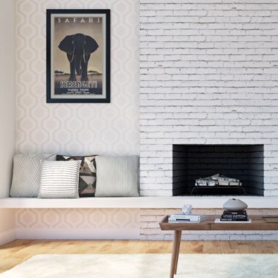
Pastel Colors; Pastel colors are the result of adding a large amount of white to colors. They create a comfortable, airy feeling in any room.

Neutral Colors; Neutral colors include shades of white, beige, taupe, gray and black. Neutral colors are the easiest colors to use for one obvious reason: They blend with most surroundings. Neutral colors can also be stylish and dramatic. For instance, black and white are neutral colors that create a wonderful palette for additional colors.

If you choose neutral colors, use bold-colored accessories to accent the walls and add interest. When you’re ready for a change, simply change out the accessories.
Picture
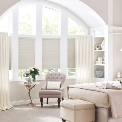
Various Color Schemes

A color scheme is any set of colors that work together to create a visually appealing layout. The following are suggested painting ideas, but the possible combinations are limitless.

Complementary Colors; Complementary colors are located opposite each other on the color wheel. Each color brings out the richness in the other. When using complementary colors, one color should be subtle and the other color should be more dominant. For example, an intense, dark violet should be paired with a medium to light yellow.

Split Complementary Colors; Split complementary colors offer a wild and daring color palette. Select a main color. Next, find the complementary color, and select colors from each side of the complementary color. These colors are excellent when layering a faux finish.

Related Colors; Related colors are located next to each other on the color wheel. These colors produce a less contrasting effect than complementary colors. For example, a dark blue-green combined with a light blue can give the feeling of floating in a blue lagoon.
​

Monochromatic Colors; Monochromatic colors are colors with the same hue but different tones, values and saturation. For example, a paint swatch card has several different values of one color. Using two or more monochromatic colors creates a stylish and pleasant look.
Picture
Planning Your Color Scheme

Here are a few tips when planning your color scheme:
  • Keep adjacent rooms in mind. Plan your color scheme in relation to how much of each room is visible from another room.
  • Pick the colors you like best; four core colors and two patterns should be the maximum. Use as many accent colors as you like to realize your wall painting ideas, and select a dominant color from the core colors to start. Choose a color scheme, either monochromatic, related or complementary.
  • If you decide to start with a favorite pattern, match your colors to the pattern. Colors that are dramatically different in the pattern can be accented with light or dark tones of the same color. You can also use one main color with several tones to create an energetic color scheme.
  • The wall color is usually the most dominant in the room, so if you're choosing paint for a wall, make sure you know what it’ll look like. Paint a 2-foot-by-2-foot color test and allow it to dry. Paint usually dries one to two shades darker. Imagine that 2-foot-by-2-foot section expanded throughout the entire room. A light peach, for example, can make a room very pink in a particular light.
  • Decide where you're going to use the colors in the room. The general rule when decorating is to use three different values: light, medium and dark. Walls and floors are usually done in light colors, depending on the effect you're trying to create. Floors should be a little darker than walls to keep them from floating. Window coverings and large pieces of furniture are often done in a medium value to pull the light walls and floors together. The darkest of the colors should be used as an accent color scattered throughout the room.​
Picture
Using Color to Create an Illusion

Use colors to create an illusion in any room by contrasting different values; light and dark, warm and cool:
  • You can visually lower a ceiling by painting it darker than the walls.
  • Make the ceiling seem higher by painting it a lighter color than the walls.
  • Use dark neutrals or warm colors on walls and floors to visually scale down a large room.
  • Make a small room look larger by using light, pale colors on the walls, floors and ceilings.
Picture
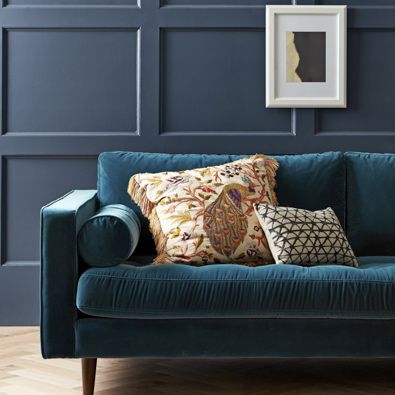
Using Accent Colors to Change a Room

Use accent colors, whether bold or subtle, to pull a room together:
  • Use one wall in a room as a focal point. Paint the wall a complementary color or a darker shade of the main color in the room.
  • Add white to a room to make patterns and colors appear lighter. If you add a dark color, such as black, the darkness of the pattern comes out.
  • Paint your walls in two bold colors to tie in with a pattern on a rug or chair.​​
Picture
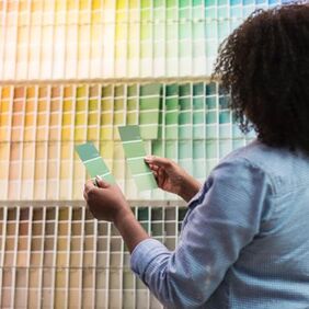
Color Chips and Swatches

Chips and swatches are helpful in the color selection process. Here are a few things to keep in mind:
  • When choosing color chips, branch out and consider similar shades in all directions. Keep in mind any furniture or artwork that's already in the room. After you gather all the colors you like, narrow it down to three or four hues for your specific project. View the colors in the same type of light as your home. Compare them by holding them next to a sheet of white paper.
  • Paint a 1-foot square poster board for each color scheme.
  • Live with the various colors for a week. Look at them during different times of day and in different lighting. Move the poster board swatches around the room — high, low, in corners and near windows.
  • Still don’t think you’ve found the right interior paint ideas? Seek out color cues in items you already own, like a favorite piece of art or furniture. Pull colors and color combinations from what you know and love. Bring a pillow, piece of fabric or even a favorite pair of shoes to Lowe's, and an associate will custom blend a paint shade to match.

Tip Remember: To the human eye, most colors on paint chips look a shade darker when applied to real rooms. If you're worried that a color is too dark or bold, consider one shade lighter.
How to Read a Paint Color Chip DisplayPaint color chip displays can look like an overwhelming rainbow of choices at first glance. But the displays are organized to help you come up with interior paint ideas.
  • Most brands are organized, first, by temperature, with warm and cool colors grouped together.
  • Secondly, they're arranged by saturation, with the brighter color traditionally on the outer sides of the display. 
  • A good rule of thumb is to stay within the same saturation level to ensure consistency.
3 Comments
Antenna Installation Columbus link
7/1/2022 12:30:06 am

Thank you for writing thhis

Reply
House Painters Near Me link
7/21/2022 02:16:38 am

Great article and very comprehensive, too. As a professional house painting contractor, I personally like pastel colors and anything green for interior painting.

Reply
wall paintng link
8/12/2022 12:29:23 pm

Thank you for all your help. Your service was excellent and very FAST. Many thanks for you kind and efficient service. I have already and will definitely continue to recommend your services to others in the future.

Reply


Leave a Reply.

    Author

    Write something about yourself. No need to be fancy, just an overview.

    Archives

    February 2020
    January 2020
    November 2019
    October 2019

    Categories

    All

    RSS Feed